Lordhair’s New Logo - Release Announcement
- Written by Lordhair Team
- Jul 5, 2019
- |
- 2 min read
 Listen to the full text
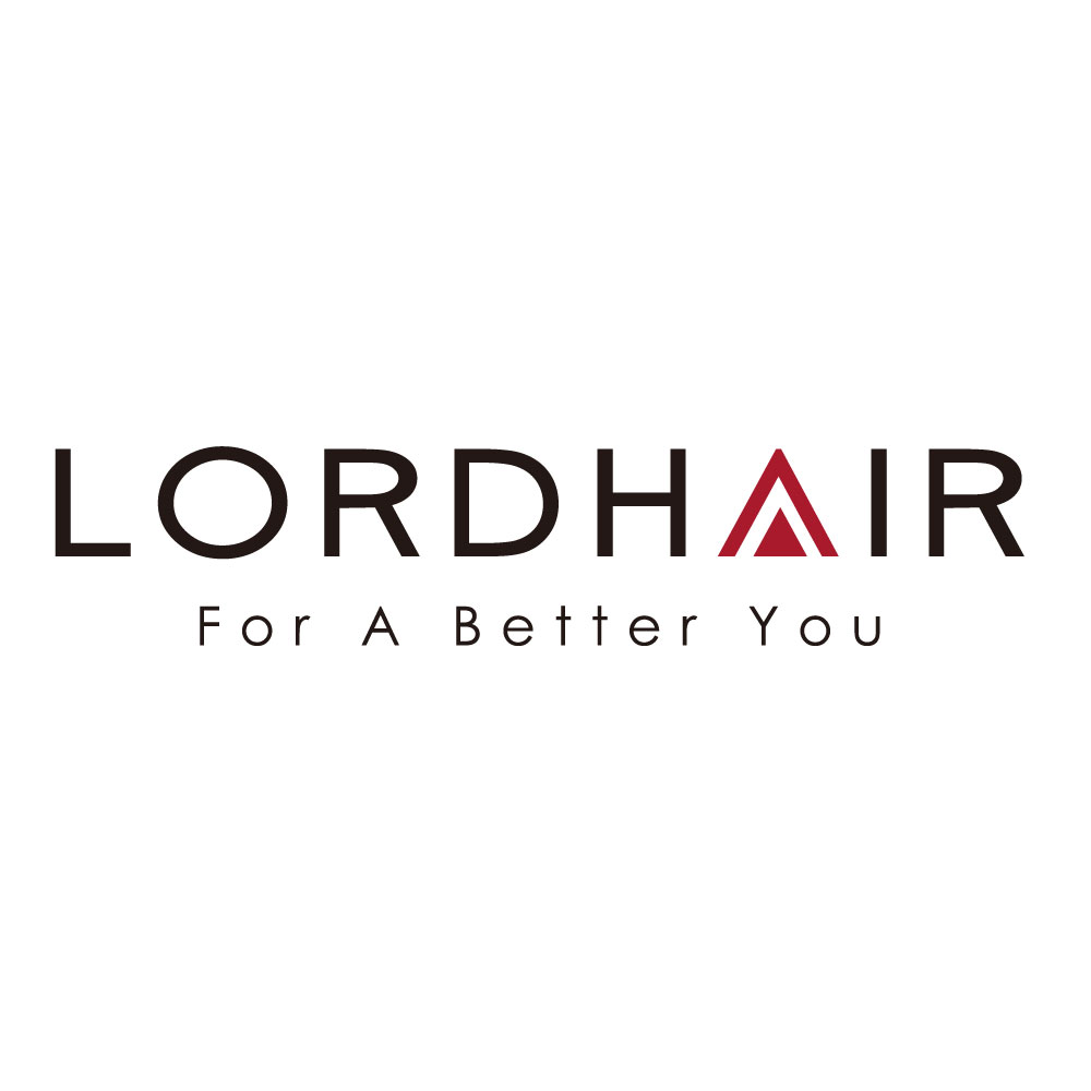
Hey guys! Greetings from Lordhair! We have an exciting news that we'd like to share with you: After months of careful preparation, we finally completed the work on our new logo and started using it on all social media platforms, packaging, and official website from June 26th, 2019.

It is widely accepted that logo is the silent ambassador of a brand. It is often the first thing a customer would recall when you mention a product. Although our new logo is not significantly different from the previous version, it better reflects that we care about our customer’s needs and current trends. Moreover, the new logo gives us a contemporary and polished feel. It also indicates that we are eager to embrace changes.
Let's take a closer look at the new logo! It has a simple, strong font that is written in bold and capital letters. We added more space between each letter and removed any traces of the old logo; so, there is no hat on top of the letter ‘d’ and ‘h’ like before. The letter ‘A’ of our new logo is characterized by a red triangle following the shape of its upper part to symbolise light entering our everyday life. Moreover, it highlights the concept of “For A Better You”.
Looking for a hair system? Discover latest Hair Systems here!
Lordhair is constantly and actively trying to renovate itself. This new, fresh logo aims to help the brand separate from the old logo and attract new consumers. At the same time, we aim to maintain the dialogue with all our regular customers, showing an ever-renewing image of vitality.
How did you like our new logo? Do share in the comments.
Lordhair, for a better you!


